Taking Movista from Typical Tech to Electric Innovation
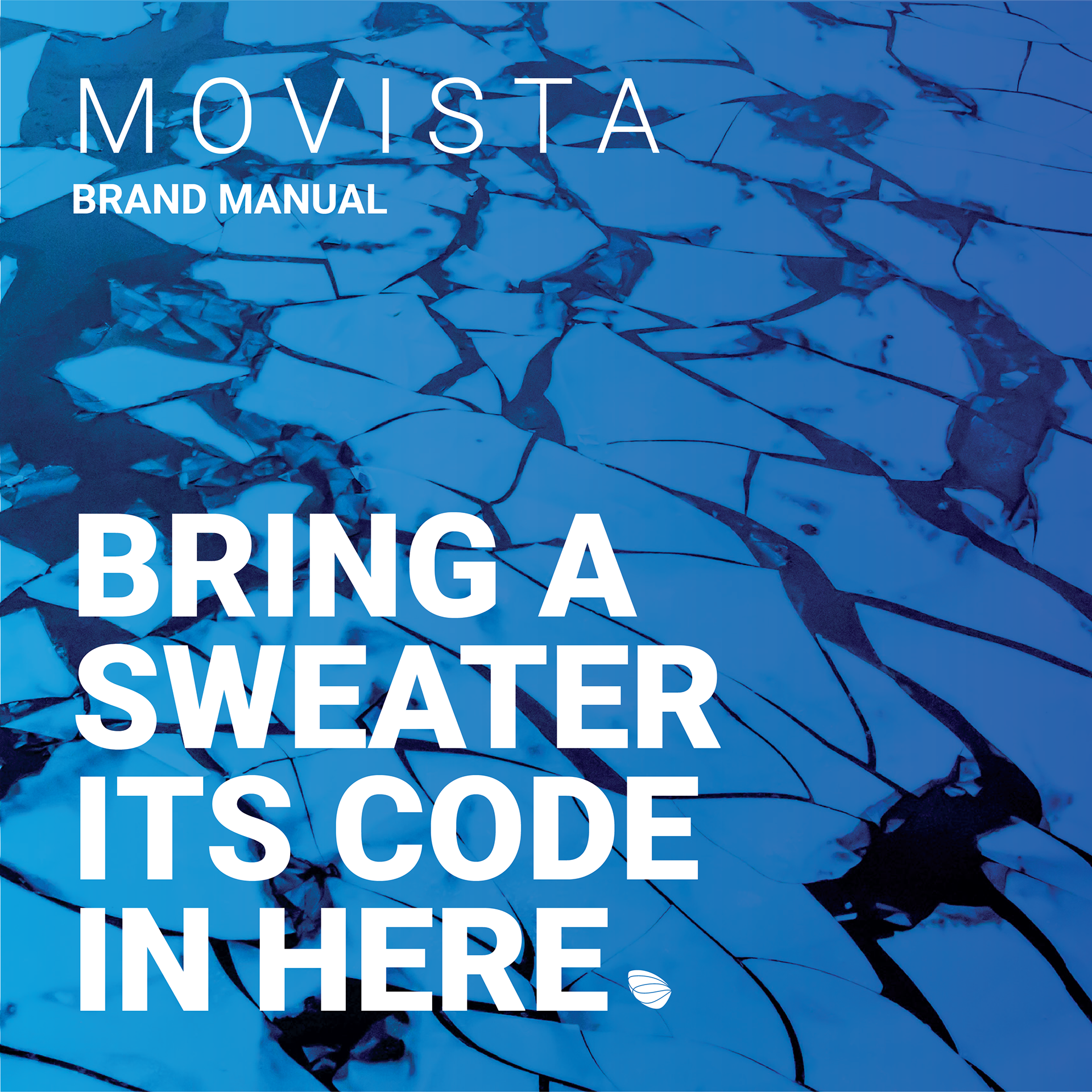
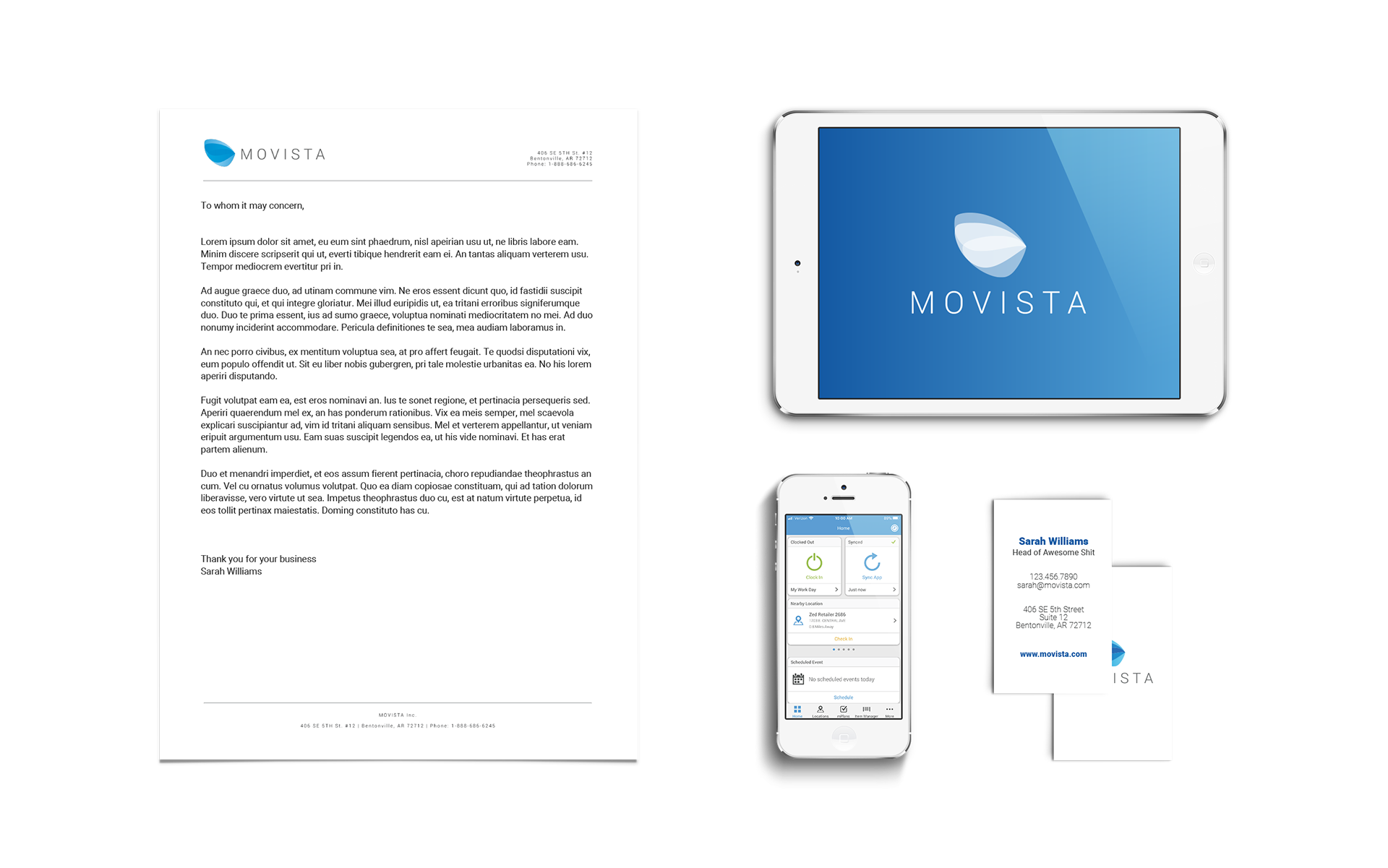
For a decade Movista followed the usual tech branding handbook: 50 shades of blue and one varied sans serif font family. Photos were forced into the brand with multiply overlays and inconstant gradients. It was a simple identity but did not stand out in the ocean of technology start ups.
Movista needed an updated website with new product forward messaging to catch the eye of prospective clients. In what I can only describe as an ass-backwards process we solved problems with new design elements and later pushed those solutions though the rest of our identity. The old style did not provide enough tools to find the creative solutions needed to really make the site pop. The current brand has been inspired but a solution first mindset. Movista's needs were considered practically first and visuals were used as a tool to best service the vision.
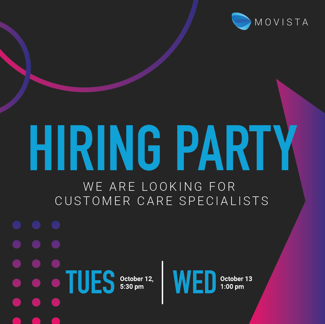
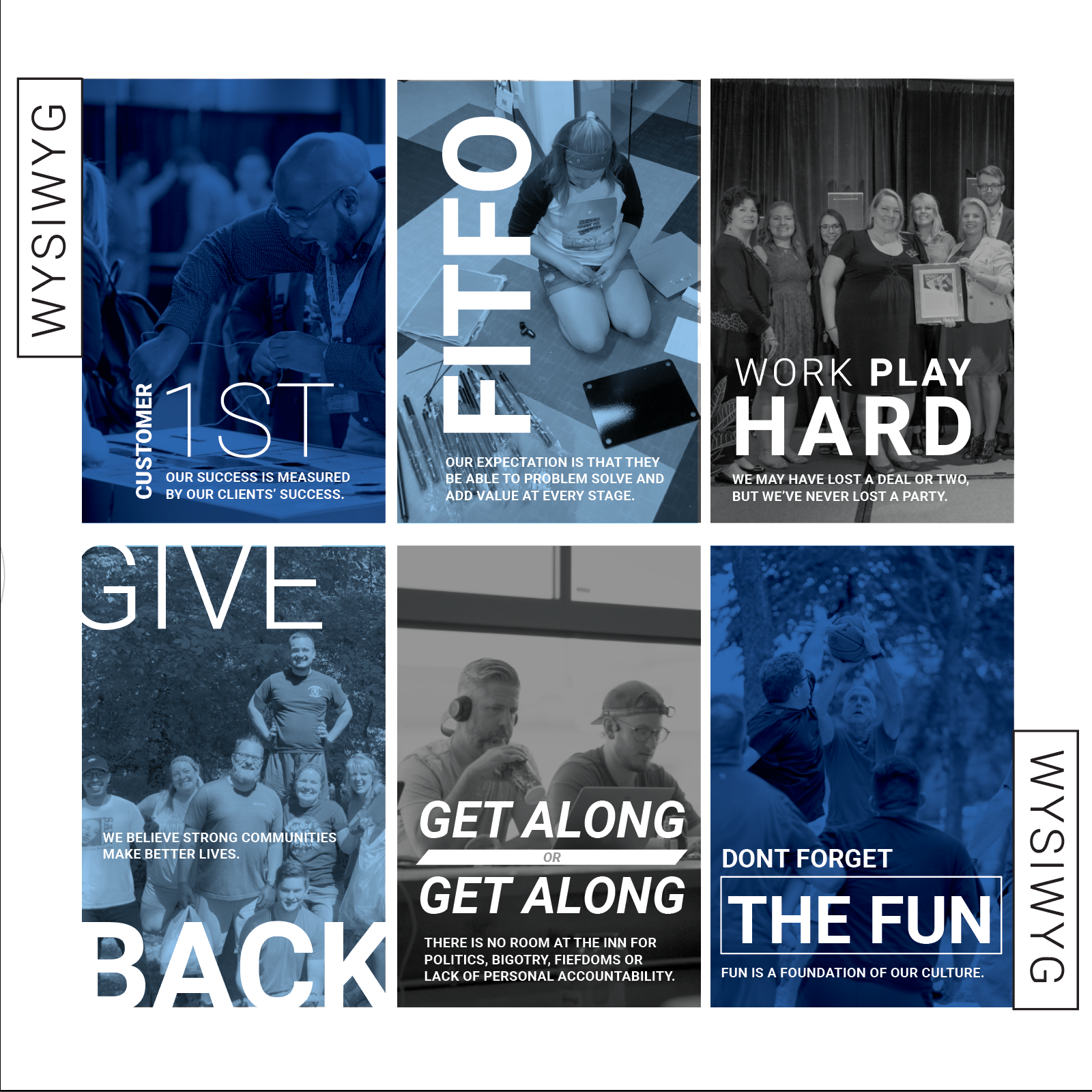
By adding a display face, amending the color palette, and equipping a suite of shapes, Movista was able to step into their can-do innovative attitude as a visual language. Later, a range of product imagery (from literal to figurative) paired with inclusive representation was introduced to fully drive home the company's ideals. This brand is who the company has always been. Now Movista is and looks electric, and nuanced. They stand out in crowded trade shows and the endless library of Linkedin ads.
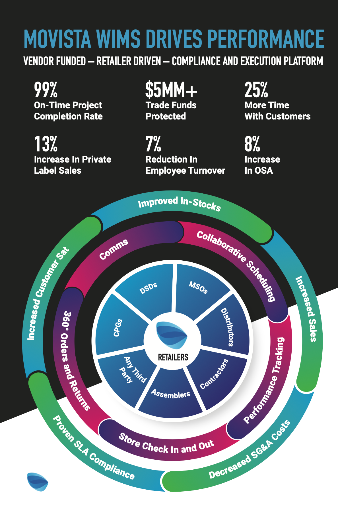
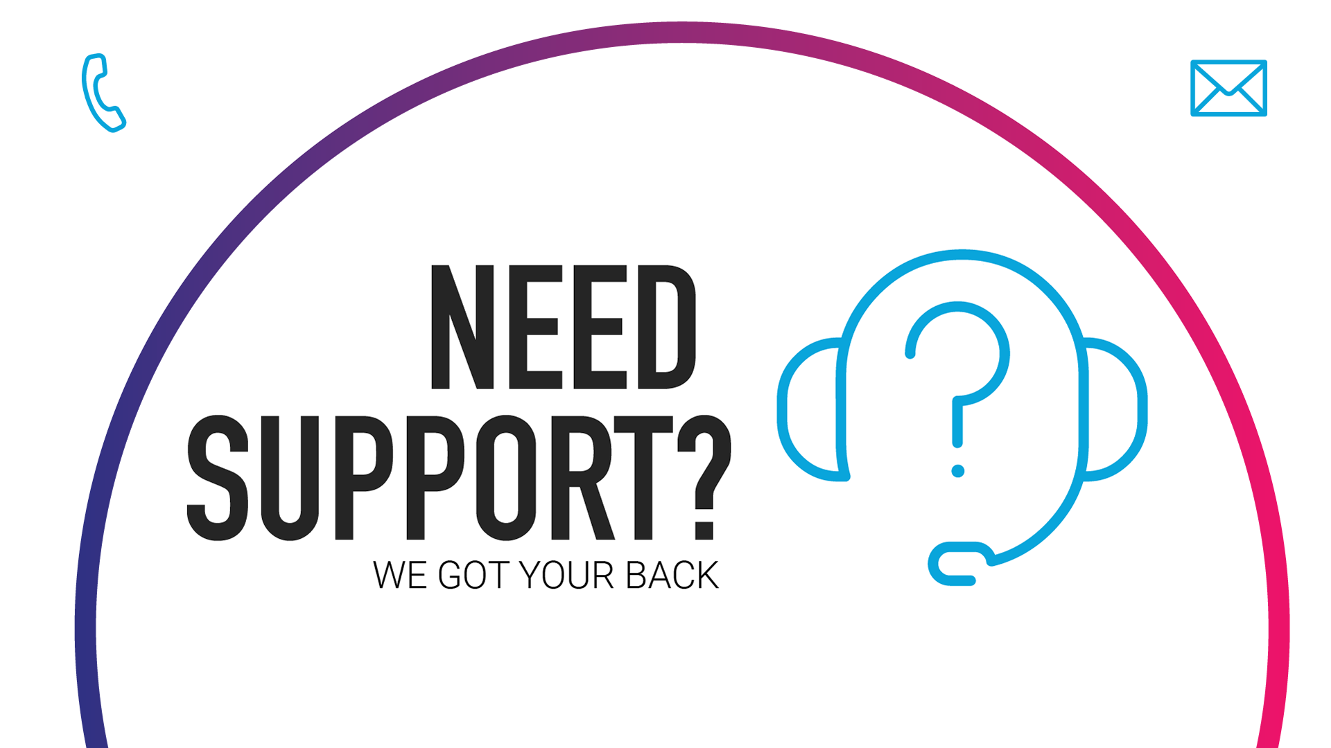

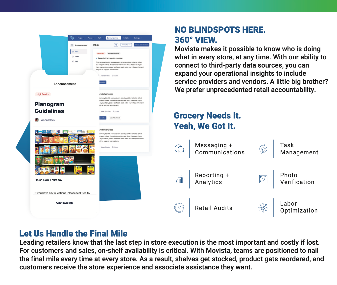
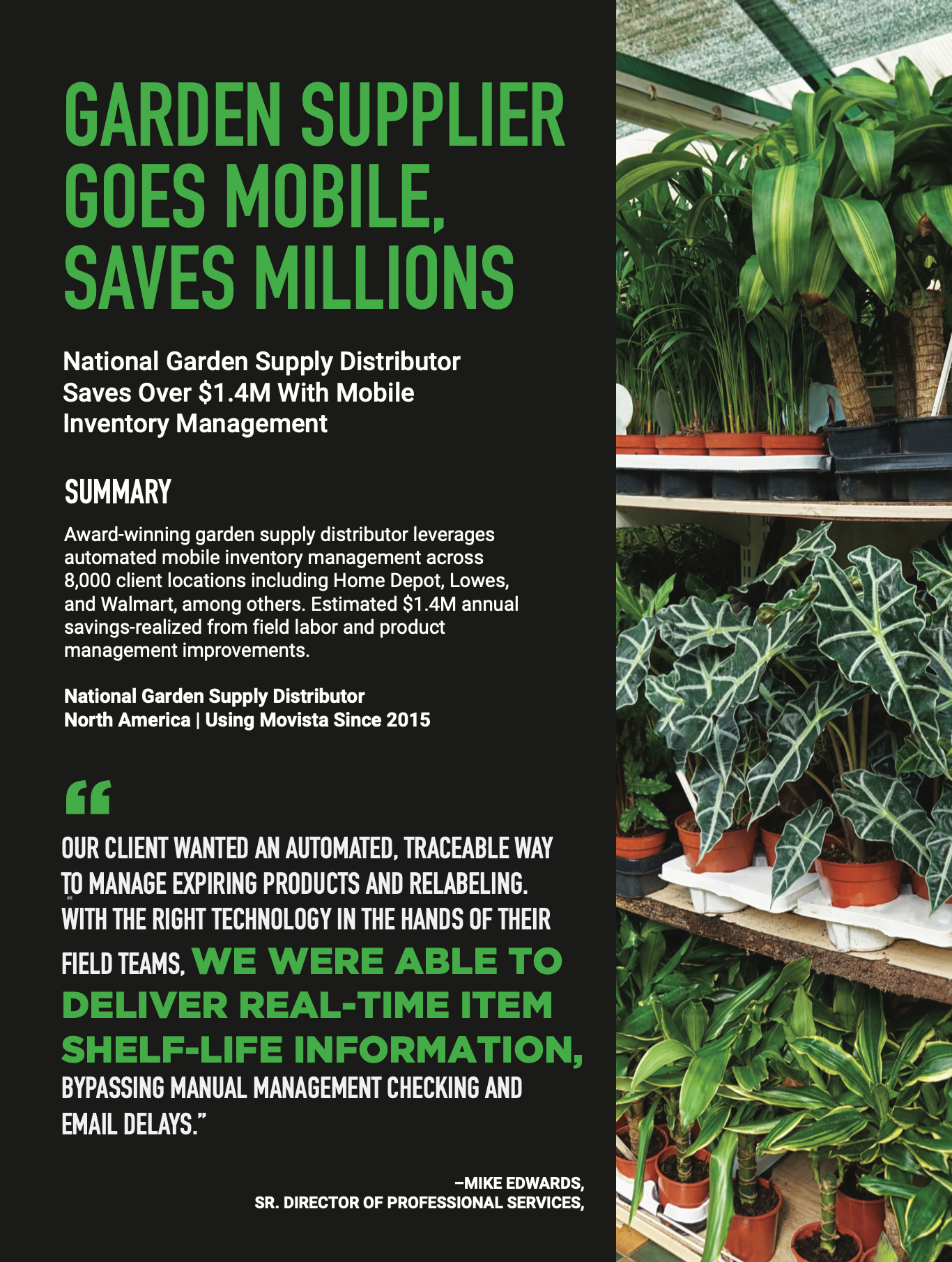
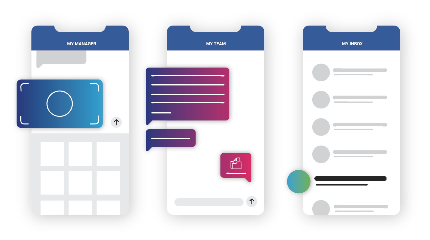
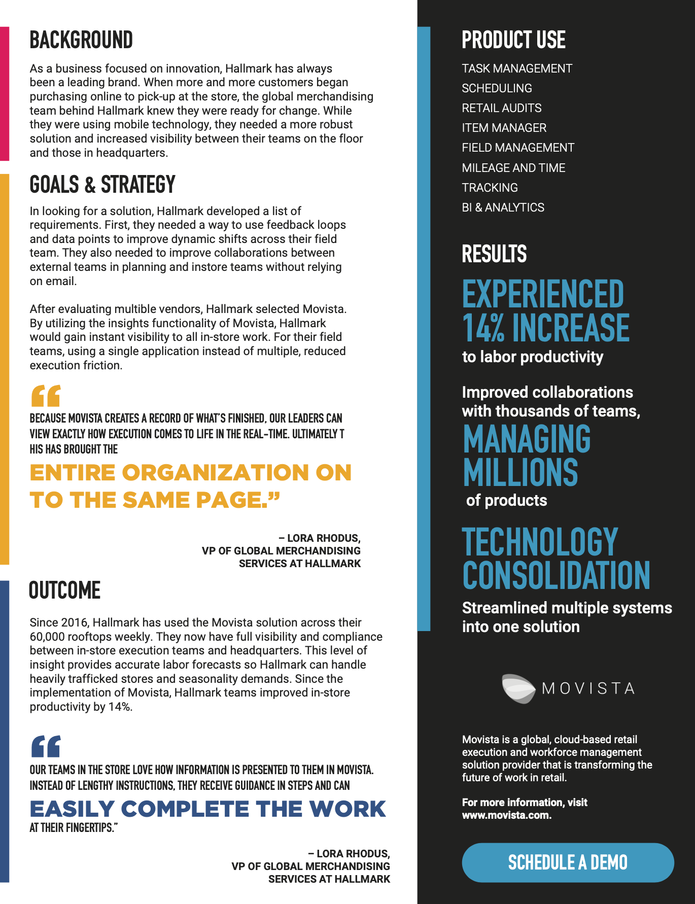
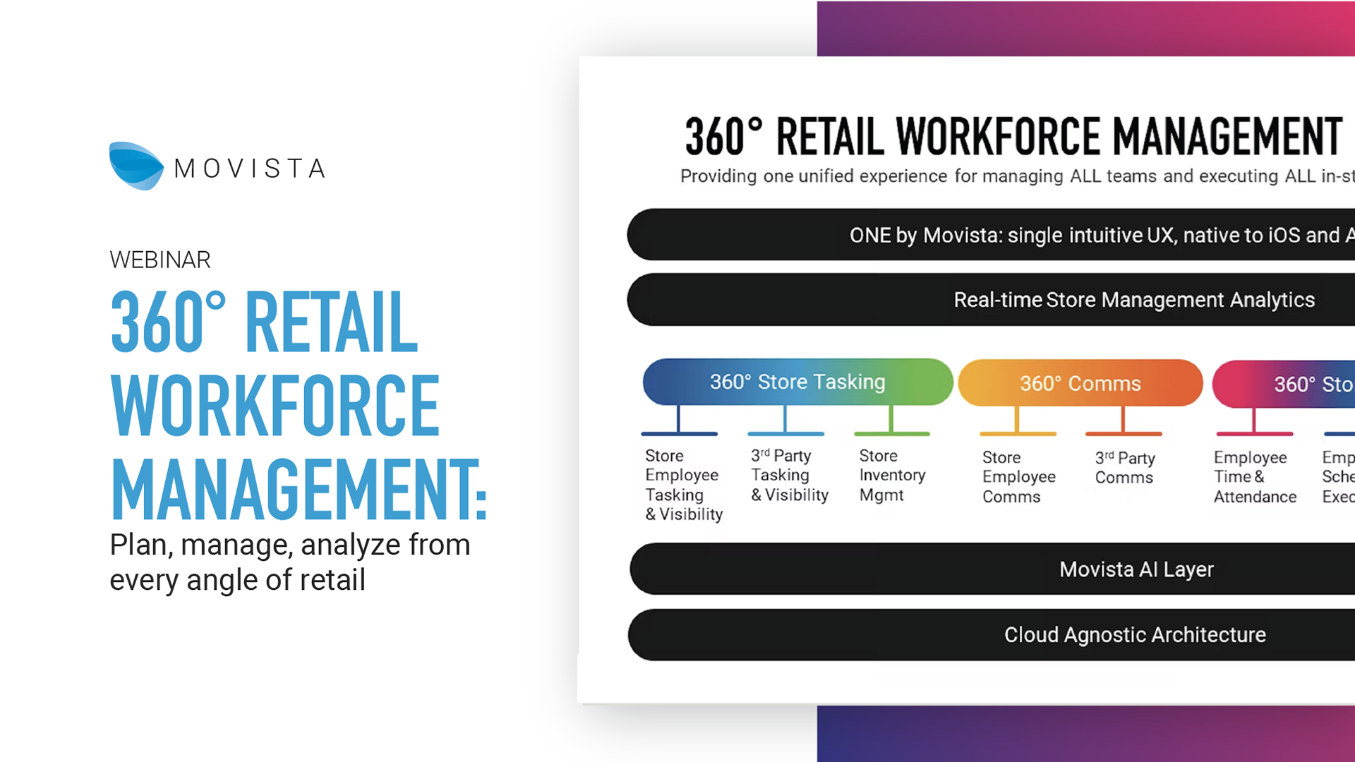

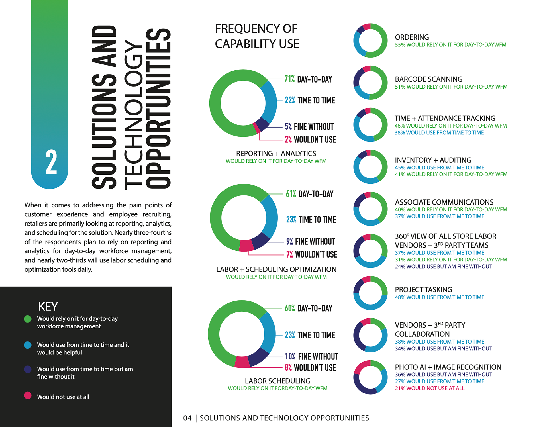
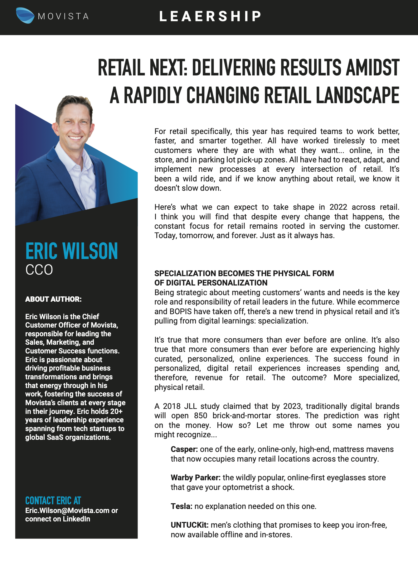

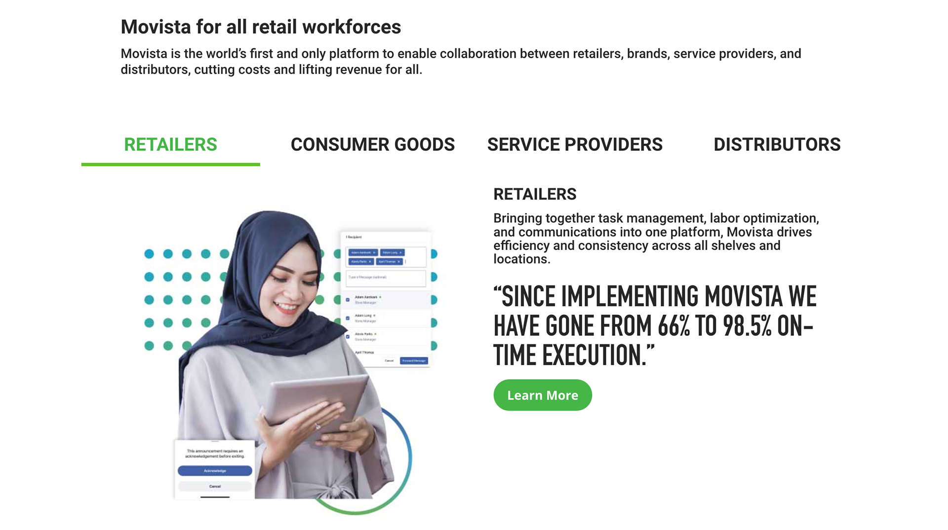
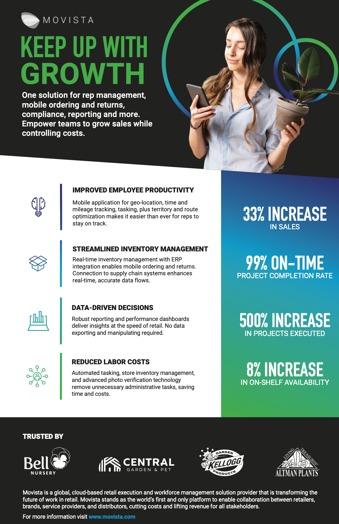
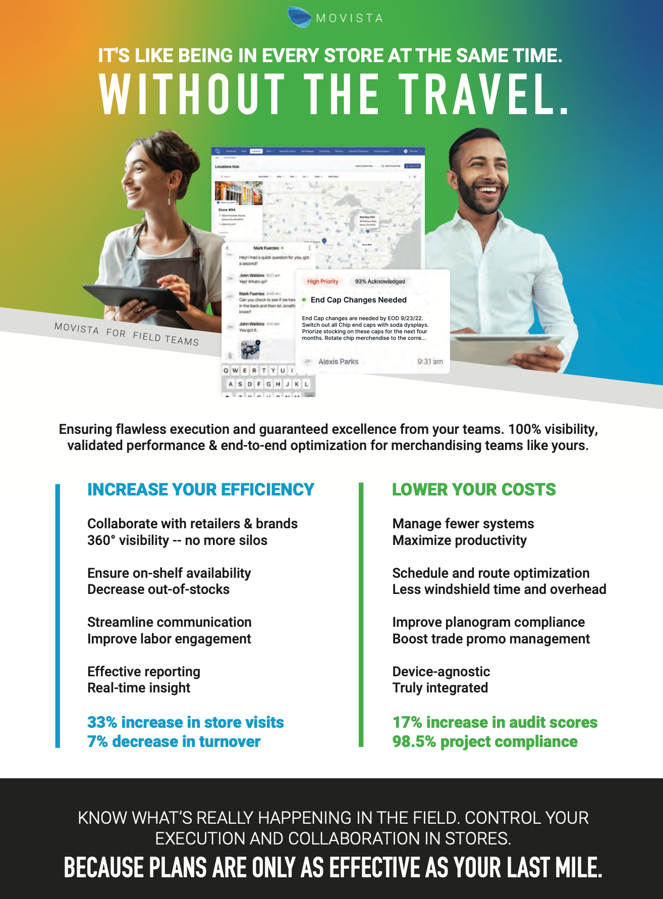

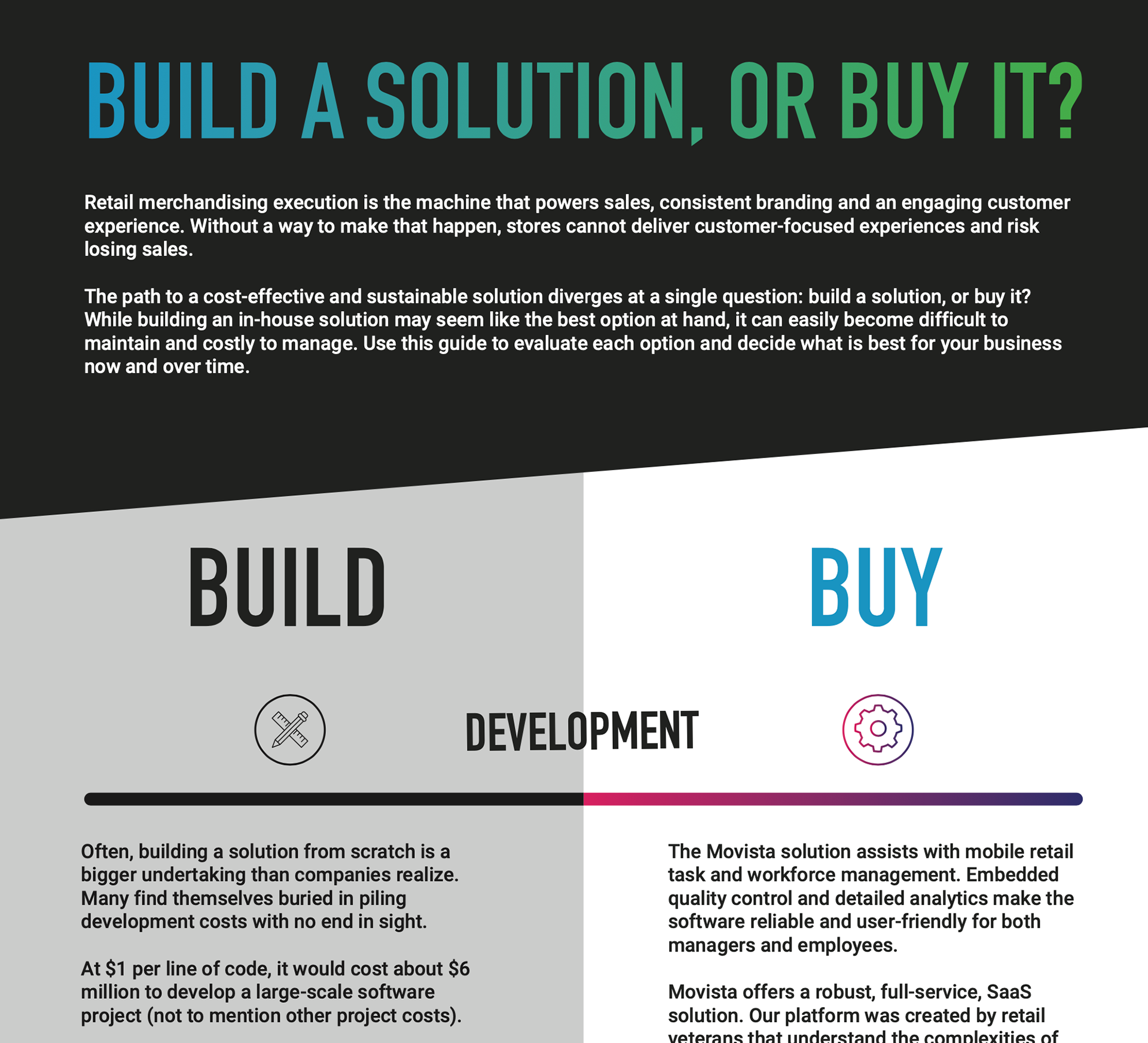
2010 - 2020
Not long after I began my time with Movista we started speaking on how our identity needed something more. I dipped my toes in and out of attempts to finesse the assets we already had. But the color palette was limited, the typefaces were exhausted, and I found that superiors who were asking for something new, were still locked in to the way they had been doing things for a decade.
It wasn't until the website redesign that I had gained enough trust to throw some curveballs that finally stuck.

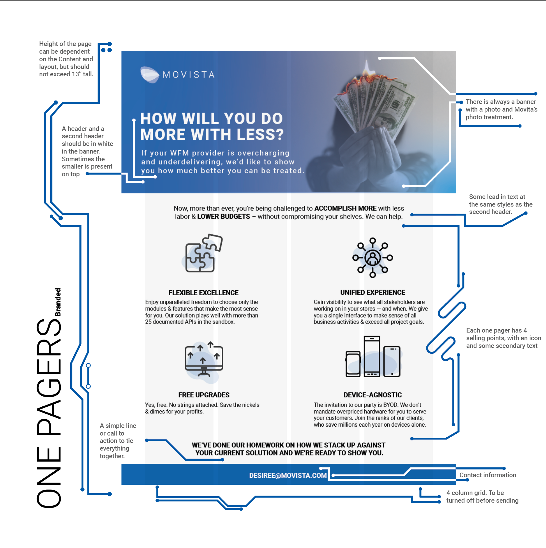
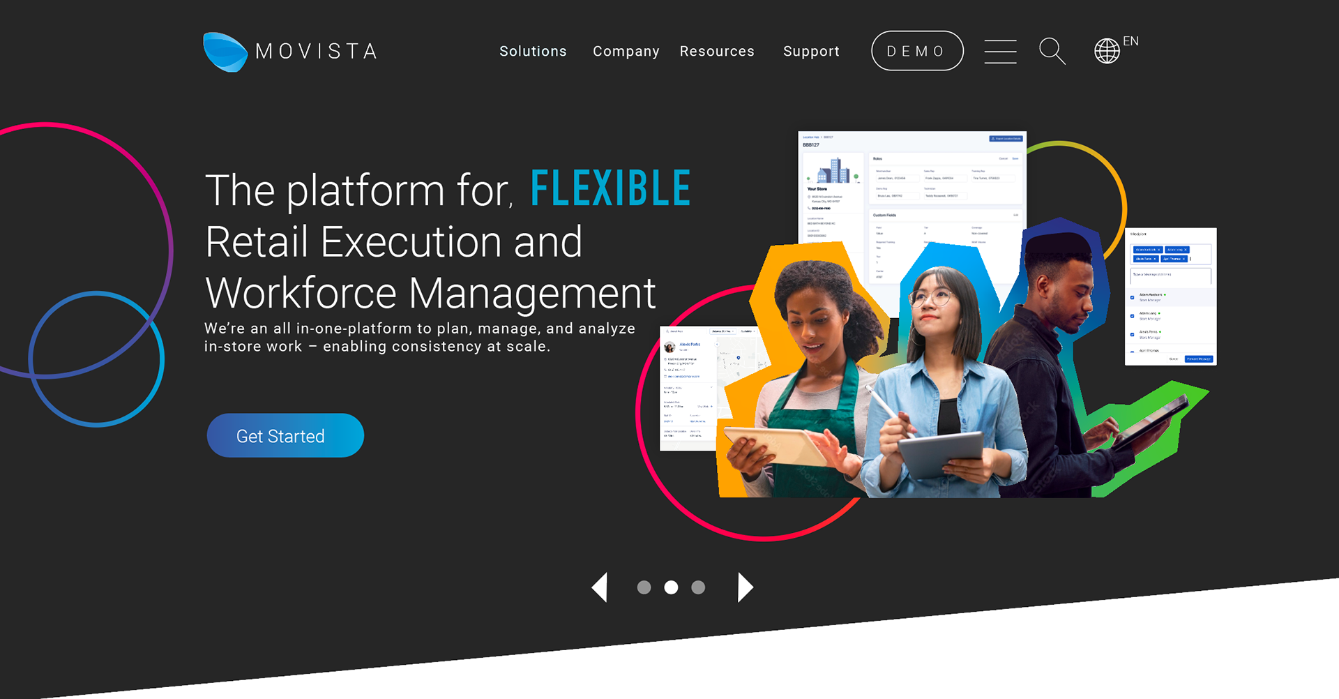
2021- Present

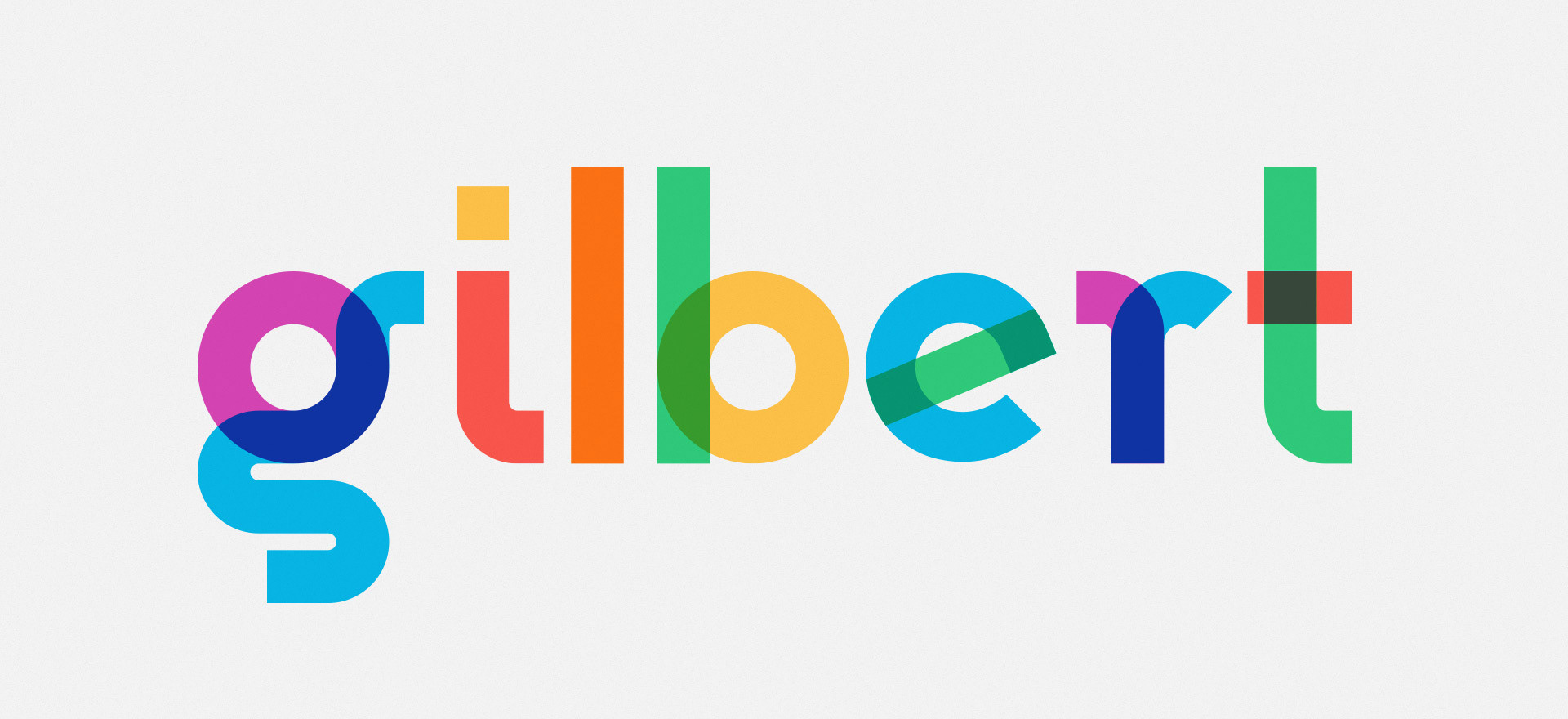
INSPIRATION
Tech is still the core of who Movista is. We want to be competitive in hiring technology innovators and be synonymous with app based solutions. Much of the new color pallet is ripped from what a coder sees in the development stages of a digital product. And We nixed the kitschy circuitry.
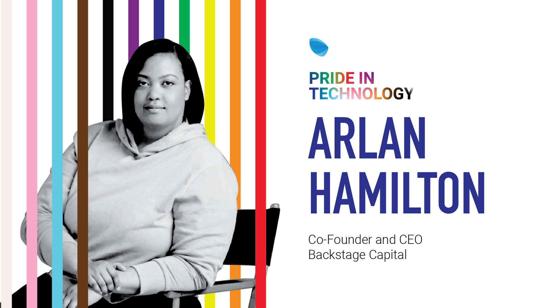
Initially I was using subtle changes to the color pallet to slide under the radar. However, the Pride in Technology social campaign was a hit with my supervisors. And after the campaign ended we missed the variety of color. And there you have it: a six member color pallet.
TYPOGRAPHY
To complement roboto, I chose DIN condensed bold. This single weight complemented the sleek classic san serif style and added a more modern slant to the brand. This is the face we use for big flashy typography, numbers, and anything that might need some extra emphasis.
COLOR
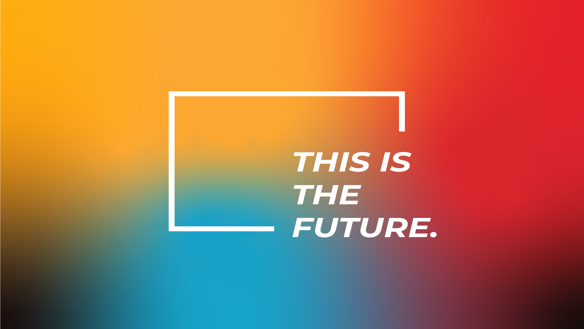
Pallet: These colors represent our electric game changing energy. They are the part of the brand family everyone calls for a good time. The saturated pallet contrasts clean lines, minimalist layouts, and stark angles.
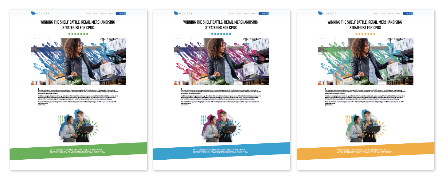
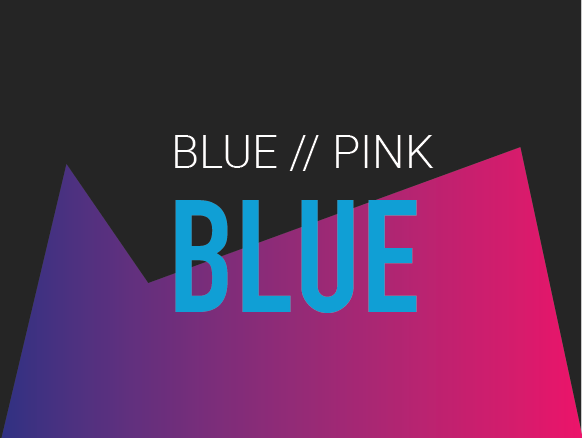
Gradients: Blue is still at the core of who we are. So all the primary gradients have an aspect of blue with their neighboring colors. Secondary Gradients can be used when more options are needed for organization and categorizing information.
Pairings: Each gradient is friends with a solid color. Who doesn't love a good partnership? Coder to Pink relates best with Icehouse and so on as seen below. Gradients are best assigned to shapes, and solid pairs to text. However this is not always set in stone.
PRIMARY GRADIENTS
SECONDARY GRADIENTS

SHAPES
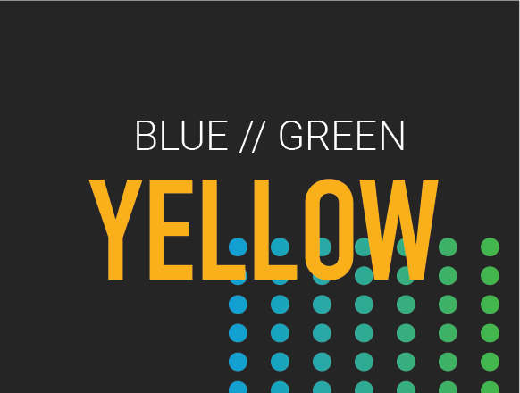
Dot Grid: Organized, clearly laid out, and consistent. The Grid illustrates the blue sky world of retail we want to build.
Circles: The future of retail is connected, seamless. This shape displays our primary function to our clients. We don't want any gaps in the information.
Pill Bars: All real world environments have variation, but that doesn't mean we spiral out of control. The differences in the bars give more choices to use everyone’s strengths.
Custom shapes: Sometimes you need more than the prescripted tools. Designers are not limited to these custom shapes. Draw what you need. Just like Movista adapts to the needs of our clients.
