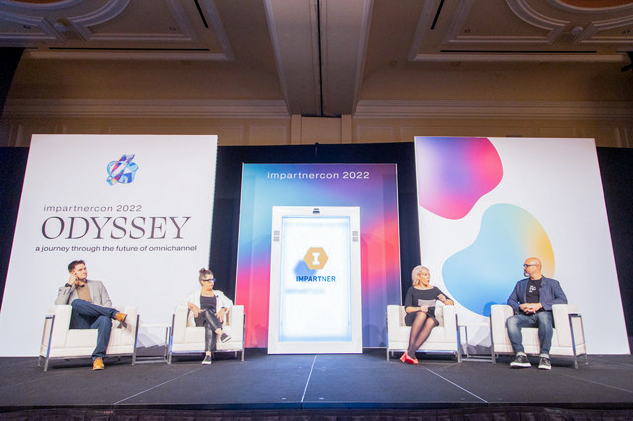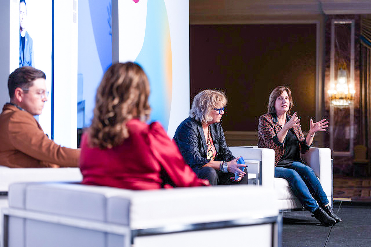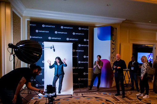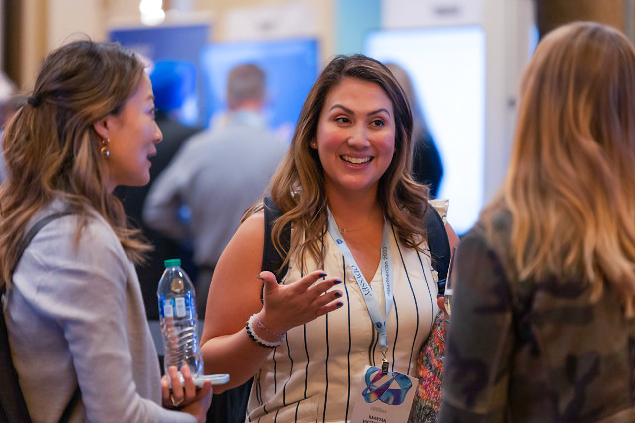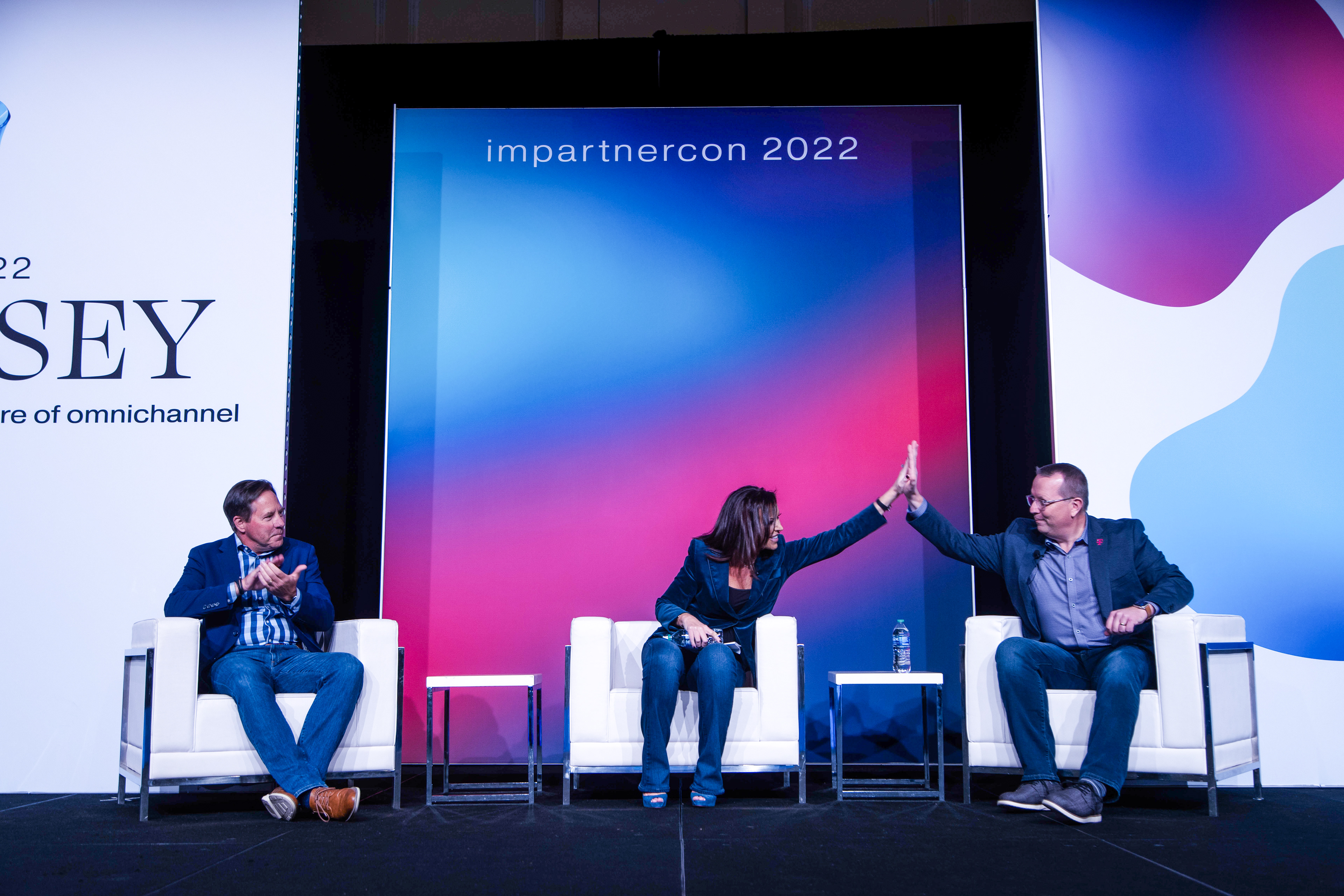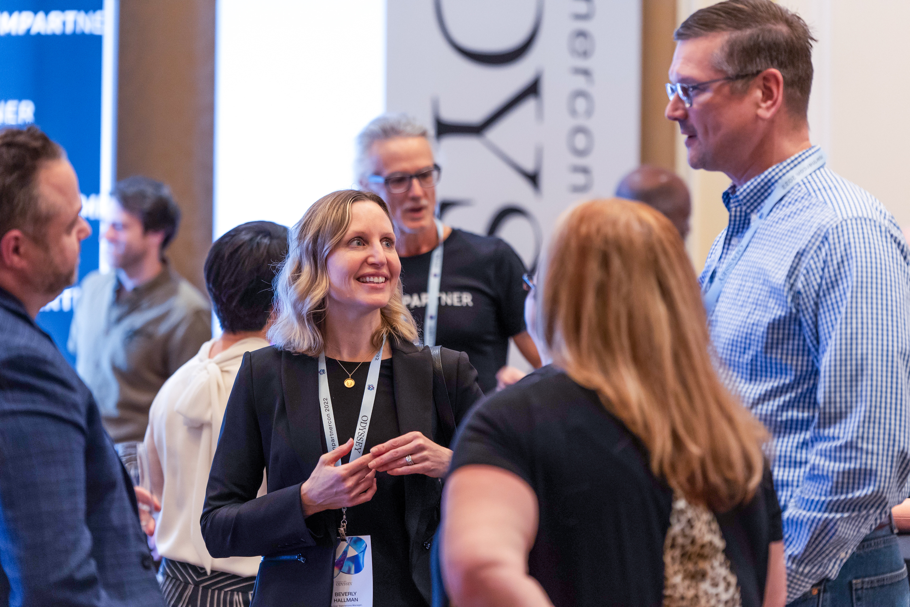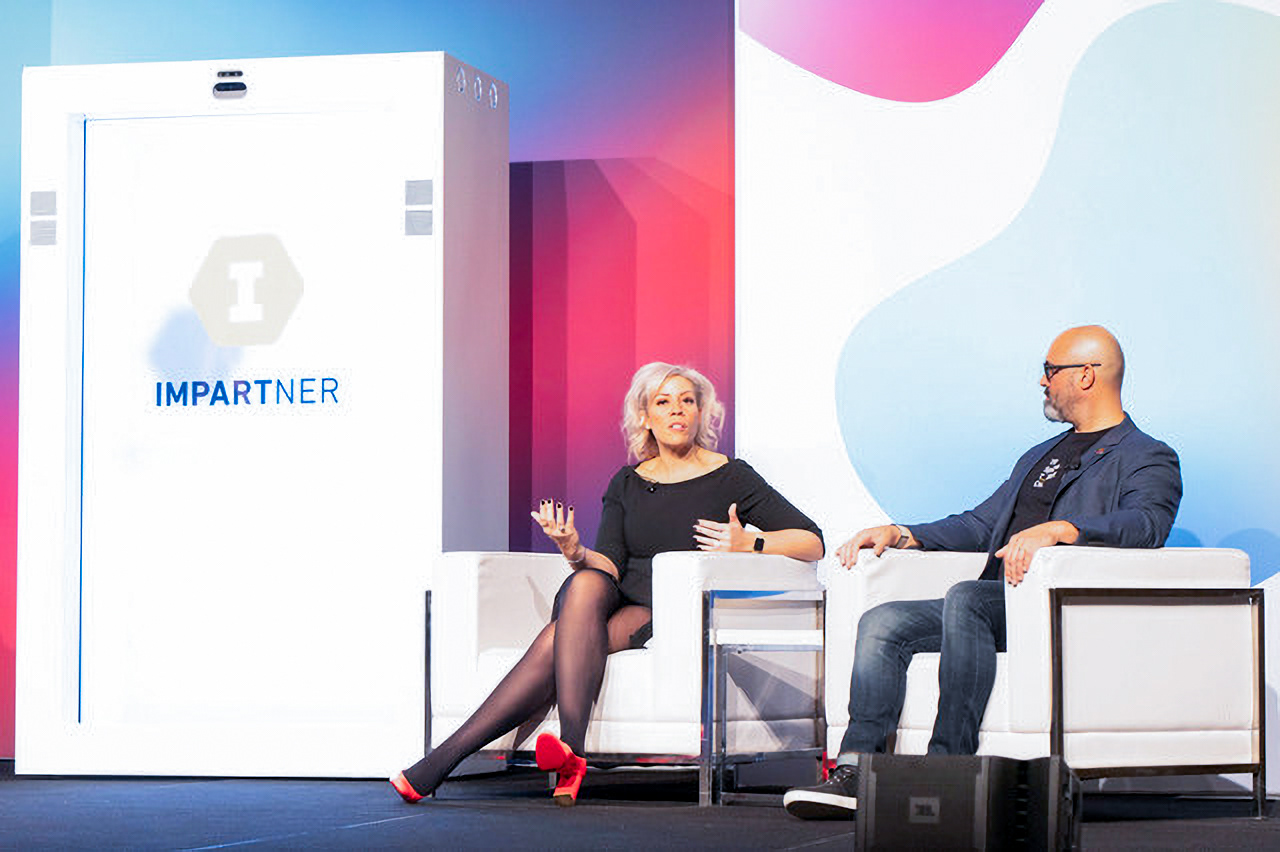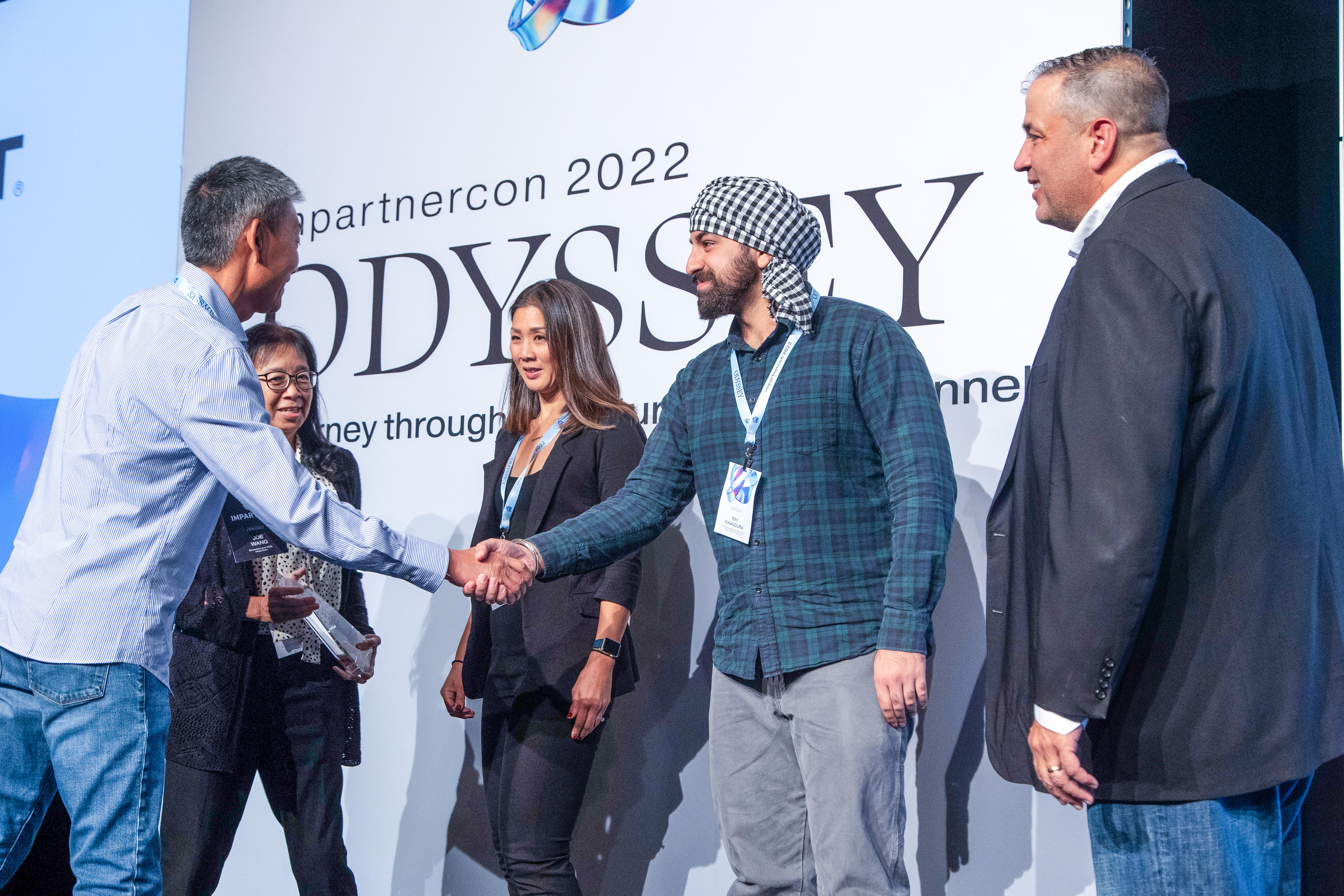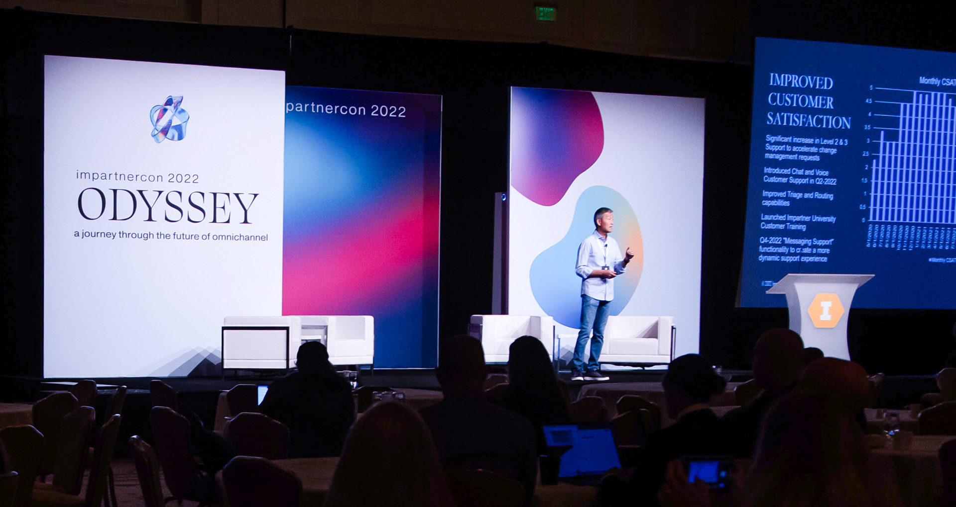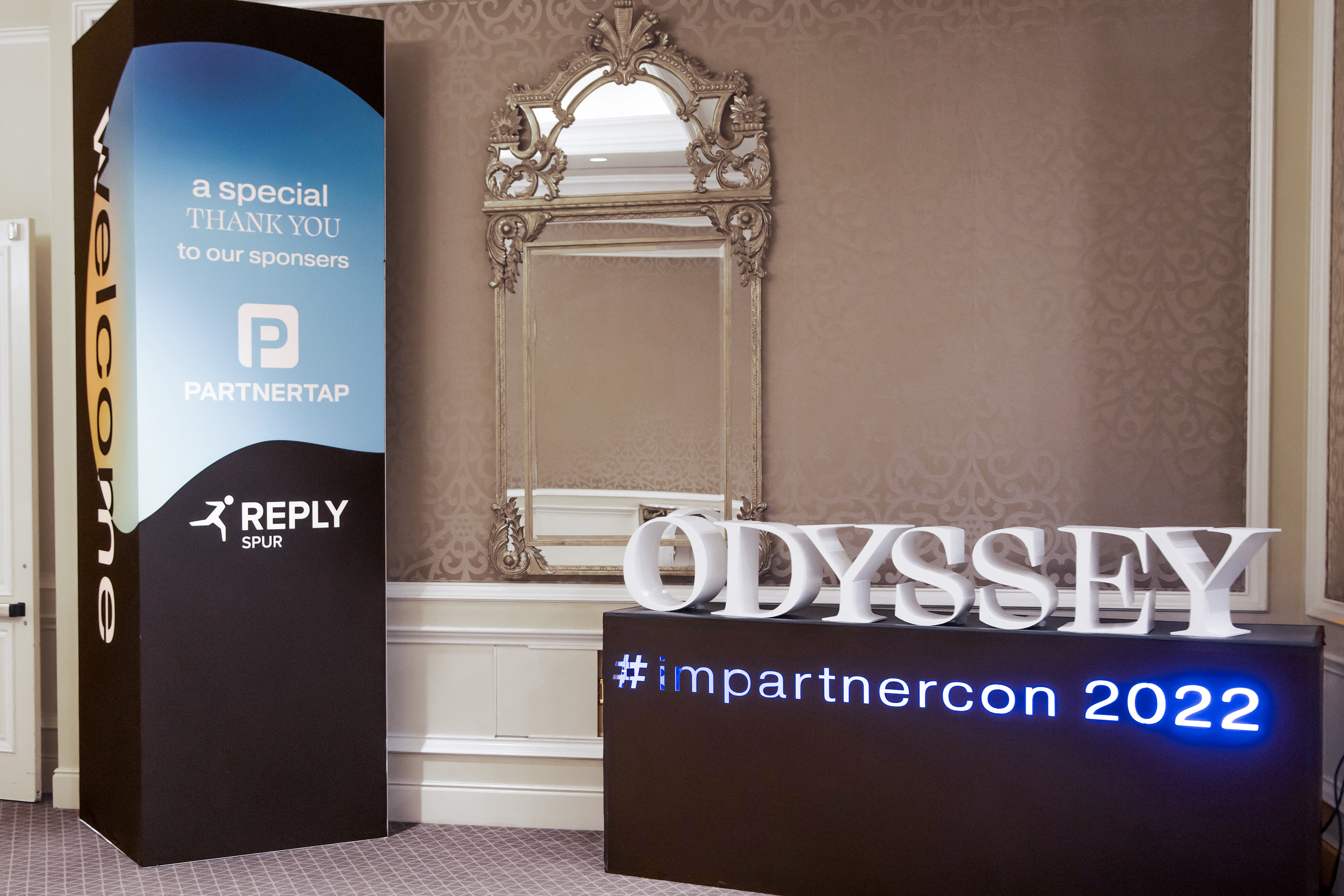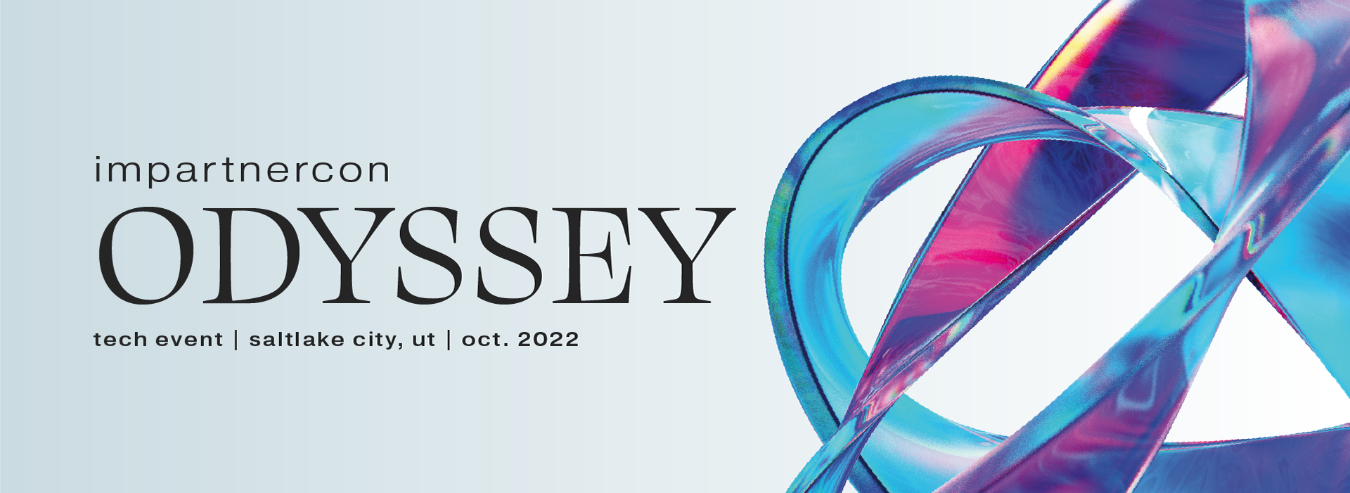

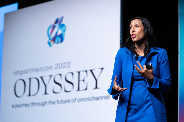
ImpartnerCon: Odyssey
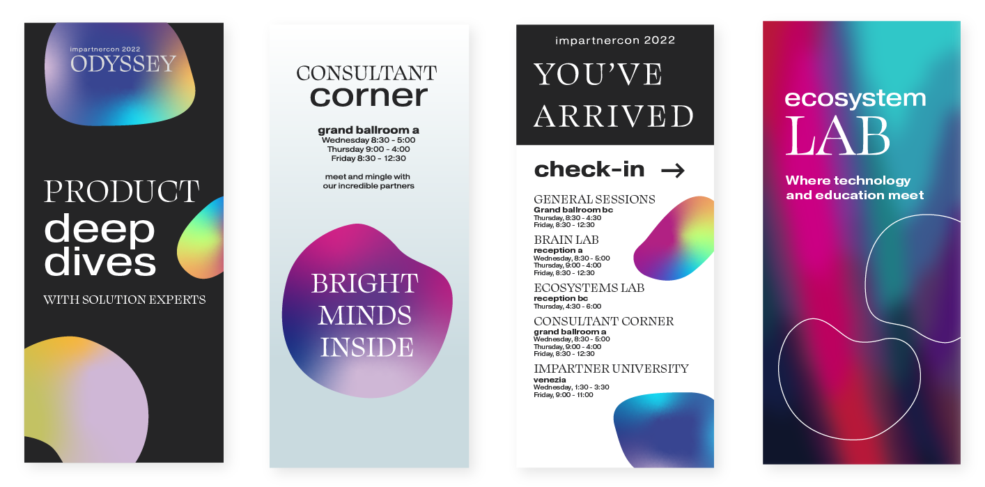
As a contractor, I created an event identity demonstrating a groundbreaking journey into the future of omnichannel. When given many options of what the project would be called, I was interested in the masculinity of the word Odyssey. Paired with luxurious serifs, a dreamy color pallet, and clandestine shapes, I was able to doctor an experience that transcends the attendees to a future where partnerships are abundant and technology enlightens us all.

The Brand:
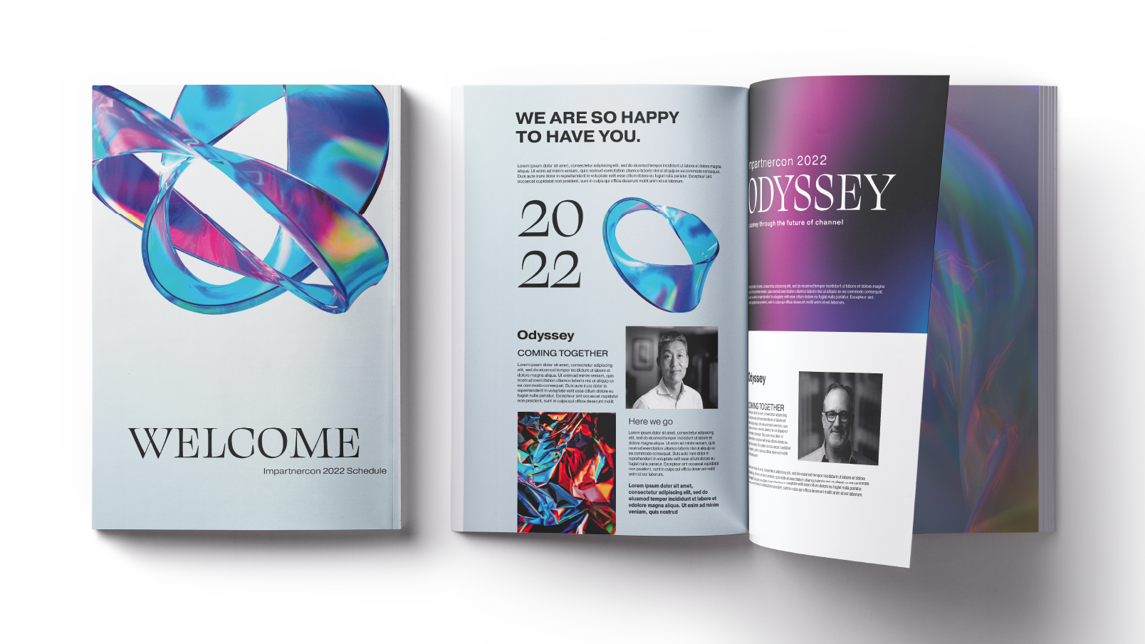
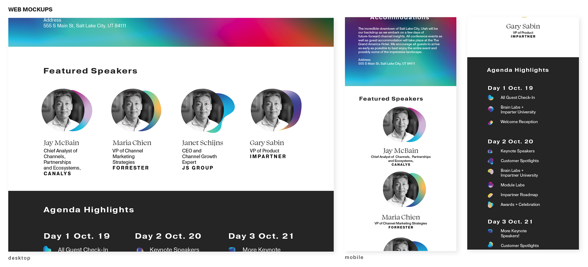
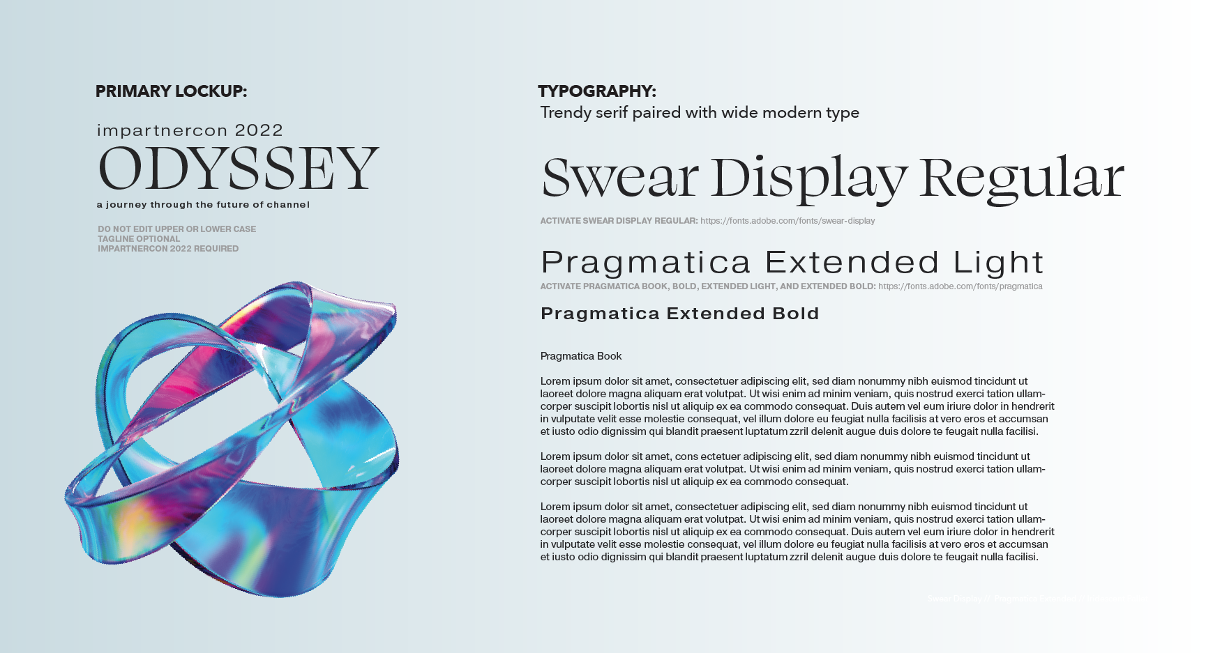
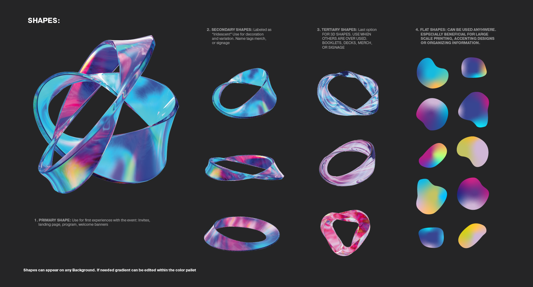
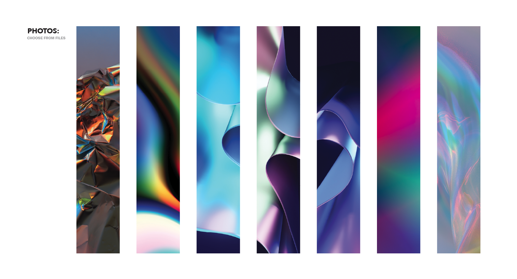
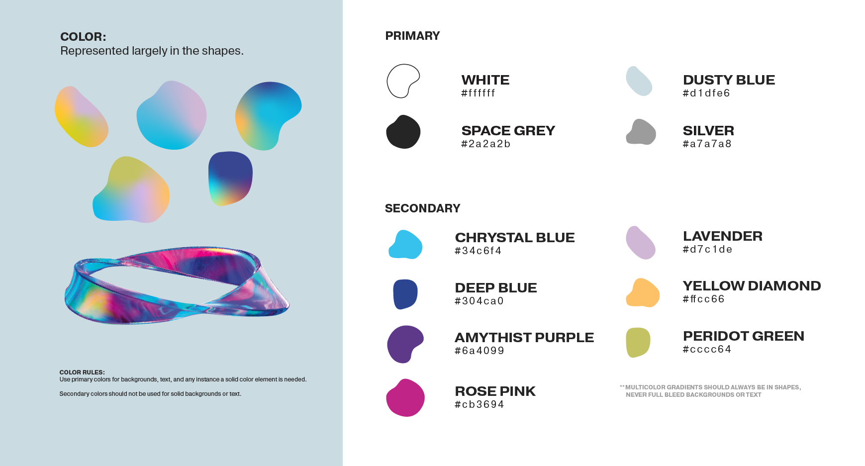
Odyssey arrived in a dreamy, aspirational brand: an aesthetic I found myself calling "Metallic Unicorn". Fluid, strong, morphic, and striking. I was thankful to source these beautifully rendered shapes from Simon Lee on Unsplash. Secondary images and color pallets were curated from the main helix. Finally, I selected a display header to accentuate the modernity, and a typeset with a wide range of customization options to keep deliverables engaging, knowing Impartner might be limited in using pixel based images for printing purposes.
The Results:
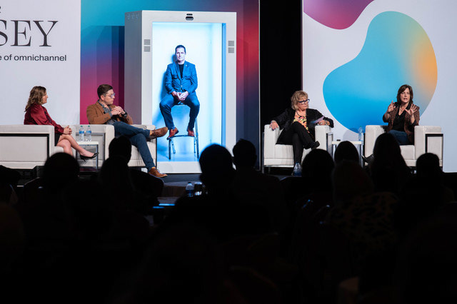
I love this event for showcasing a dreamscape that welcomes more than the usual suspects at a tech event. Each deliverable, physical or digital was striking and unique. Odyssey is a wildly fun brand in which to work. ImpartnerCon Odyssey was hosted in 2022. After its success, I was invited to join the team full time as Creative Director. Poke around my portfolio to see ImpartnerCon's next iteration: Multiply. And the Brand Enhancements implemented in my time there.